a glob of nerdishness

September 8, 2011

Goals, or: You are not alone

written by natevw @ 12:02 pm

I am a perfectionist, which is difficult but probably more difficult for my family and friends. I am also sloppy, which is difficult for a perfectionist.

-
When I started working at &yet, the team then were all throwing themselves into one exciting project. Those days are gone, and these days I find myself stuck with “the mess”, while “those responsible” have scattered.

I also find myself having to just build more mess, because that’s the best I can do. And wanting to scatter.

-
We can do better, and must.

-
The perfectionists need to learn patience with people. People change, even are made anew, and sometimes suddenly but never from the outside in.

The slopsters need to learn patience with products. Products change, are in need of constant refactoring, and to build them suddenly rarely leaves anything salvageable behind.

-
We can’t do better alone.

That’s the thing. If I were fired from &yet tomorrow (HI ADAM!) this, what I have learned, would be my severance package (JUST KIDDING ADAM!):

You can’t do better alone.

-
We have really lofty goals — we do don’t we? — they are Ridiculous Goals. If we think we can accomplish them more ideally or more quickly alone.

-
So my goal is to teach, a team to teach.

-
July 2, 2011

Parting questions for PalmHP

written by natevw @ 2:51 pm

To be clear, I LIKE webOS and want it to succeed. :/
Steven Frank, 2011 July 1

One of my first memories of Palm’s new “New Palm” thing was when they were in the papers every month for making their first webOS device pretend to be an iPod. For USB syncing purposes. Clever way to get some free advertising from MacRumors, but you know what? I hate what iTunes has become and loved being able to just drag and drop MP3 files onto my Palm Pre 2.

Anyone wanna buy a Palm Pre 2?

I tried to love it, just like how for years I’d been trying to love the heavy, bulky reel mower I also bought online. It’s good for the ecosystem, it’s got some very very nice qualities designed into it…

I’ve decided I don’t like either the lawnmower or the smartphone. And while I don’t need perfect landscaping in an efficient amount of time or energy, with greater responsibility at work comes greater need to join the same technological century as the rest of the world. Even though I’ve owned a Palm Pre 2 since last December, it’s never felt okay nor have I had room for it on my person. Thus it was not until this week that I became a cellphone person.

More honestly: I am now an iPhone people. It seems like such a silly insignificant change to go from having an iPod touch always in my pocket to an iPhone always in my pocket, but for me it is a defeat.

When something fails I wanna know why. So here are some poignant, probing questions that will magically make Palm/HP awesome again:Good questions are hard please read the following rants instead:

  • what’s with the HP logo when my phone reboots? The original palm wordmark was a reserved, artistic logo. The new .(h|p)*…thing is a glowing gradient of a corporate wart that only calls all the nice things the Palm people have said about their acquisition into question.
  • for example. why is “http://h41112.www4.hp.com/promo/webos/us/en/smartphones/pre3.html” the URL for the Palm Pre 3 (and why is it down while I’m trying to gather info for this post?)
  • why is the Palm Pre 3 still only [no worky web page, no getty authoritative tech specs...] X millimeters “thin”-ner than the mainframe computer I am typing this on?
  • why does it still have a stupid slidey keyboard thing that I could never shake the feeling would remain in my pocket when I accidentally pulled out only the other half?
  • why, after I really really really wanted to love my Palm Pre 2 but couldn’t, am I now completely uninterested in any incremental non-improvement you’ve not really made at all since then? Since the very first Pre?!
  • I know HP used to be a great company and all, but can you please just license the poor operating system that still somehow shows the most spectacular promise of being potentially both usable and open, try taking it and licensing it to a company that might actually be capable of combining it with some decent hardware before it’s too late?
  • and also: I said “potentially spectacular” operating system, not “actually spectacular”. Pls to put a hard-driving perfectionist in charge of software. No more Mr. Nice People, otherwise only Mr. Nice People will be able to say Mr. Nice Things about the promising prototype-grade rubbish you keep. shipping.
  • Buying an iPhone was a defeat because now i’mStuck with iCloud instead of a Synergy plugin that could talk to data on a server I control. Now i’mStuck with iStore monopolies instead of your fun official instructions for owning the device I bought. Now i’mStuck with the same iPhone that everyone else and their soccer mothers all sport like a luxury item because a truly useful phone still is — and it’s cheaper than yours!

    But the saddest thing about it all is that this sticks me with an even better web browser — w00t! — than I got on a platform called webOS. So even while Apple keeps shoving native adults into a sandbox, they’ve also been pushing web technologies up towards where I suspect native vs. web will meet: the same amount of power, but on the latter: the freedom to innovate that only a real platform can provide.

    The web is the only tool developers have left. I feel defeated because it’s not thriving as or even on anyone else’s operating system and I don’t know what that means.

    June 26, 2011

    The Continued Adventures of ShutterStem

    written by natevw @ 12:33 am

    The working motto is that ShutterStem is “trying to make taking photos fun again”.

    And it’s this nebulous dream, and that’s okay for now.

    Some moonbeams for holdy paws:

    • so iCloud is a relief. I doubt they even sync metadata, but at least Apple finally woke up and realized that they needed to do something about the iMac sitting at home not being useful most of the time.
    • sync was gonna be the killer feature that made the world beat a path to ShutterStem’s door, but giving everyone a private server without needing everyone to be a devops ninjas and/or having to make hardware etc. etc. is a Hard Problem even with a CouchDBs at ones’ disposal.
    • so it’s nice that iApple have tackled the low-hanging fruit and the 90% may soon have something practical, useful, and just works, while still meanwhile I “trying”
    • what is an ShutterStem? then?
    • the medium-term goal is just a collection of tools that shows off why I heart CouchDB and how it can help a small niche of photographers who insist on doing some things the hard way (=my dad and me and you if you want) get things done a little more easily and better…ly
    • so you’re rewriting stuff again and this will never be finished?
    • probably? look. this is not just an audacious dream of a platform for photos, but it is also a platform for a bunch of audacious ideas about how the web should just connect people to extensions of their own selves and to extensions of each other, rather than be the warrantlessly searchable home of all our eggs in one basket. this kinda stuff takes time, filing out all the paperwork through the proper channels and whatnot if you aren’t impressed with ill-fated shortcuts

    French Revolution?! Where were we. Oh yeah…

    • photos fun again?

    So I’ve had this vague notion that my photography hit some something and then wasn’t fun anymore. That’s really all this little ShutterStem hobby is about…playing with the slightly more “revolutionary” side of some neat technologies to somehow somewhere get back to the days where I were outside taking pictures that were fun to look at again and again. It doesn’t matter that App Stores are evil or any other stupid politics… I just wanna help make some photo app that kinda surprises and delights even in its nichey nerdishness.

    So what’s the wall, where maybe should I push for revolution?

    I wonder if it’s…if it is related to my capacity for mental inventory? I have a bunch of gadgets…but I know where each one is, and all its accessories. I have piles of books…but I can picture each one on the shelf in my head. I have tons of deadtree and digital documents…but I can generally track down the one I’m looking for. I even know where, within our two-year old’s scattered arsenal of real and supposed toys, the better part of half our kitchen utensils likely lie….

    But I might as well be backing up a bazillion blurry photos, because that’s the haystack that one day my brain stopped looking for needles in. And I wonder if that’s when photos stopped being fun?

    So besides being OpenDoc, besides being Unhosted, besides being W3C or RFC-worthy or maybe instead of any of all of that, ShutterStem just needs to help me [help anyone] INTERNALIZE THE INVENTORY. Helping as only computers can help. ing.

    • Q. Does that mean I’m starting over with yet another prototype(s) instead of shipping some sort of v1.1?
    • A. Meh.
    • If you’re sticking along for the ride I’d hate to bore you.

    May 7, 2010

    Multitouch usability

    written by natevw @ 9:15 pm

    An interesting comparison of the iPad to the Kindle with respect to accidental button pressing reminded me to share some observations and a link about the “naturalness” of multitouch gestures.

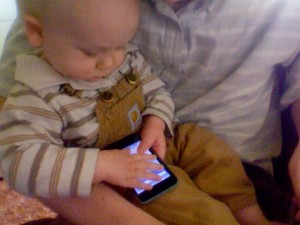
    I let Tobias hold my iPod touch occasionally. He’s at the age where flipping it back to front and back is plenty fun and his curiosity is mostly towards how it might taste. He’s not very interested in interacting with it, but I think he could be if it were a little closer to his normal experience.

    Tobias holding an iPod touch

    Of course, with the glass screen he feels no relevant tactile feedback. So there’s a significant abstraction right up front. Furthermore, since my iPod is the first model, it doesn’t have a speaker for regular apps to use. So he rarely hears audio feedback. But the issue that I noticed most is that, typically, he doesn’t even get to see any visual feedback. The touch gesture he is paying attention to simply doesn’t work.

    Since Tobias can’t “palm” the iPod (he just turned ten months old) he’s typically got one thumb smeared across the screen just to hold it. In this situation, most software just ignores the actual touching of his free hand [okay, it's more like slapping, but...]. Software that does handle multitouch often fills its corners with hot areas that activate settings instead, which is even less interesting than interface he might otherwise start figuring out.

    I don’t entirely fault the software; most of it is designed well for adults or at least children who can talk and follow verbal instructions. It’s just been food for thought, making me even more embarrassed that Sesamouse (my utility for enabling real multitouch gestures on the desktop via a Magic Mouse) doesn’t even recognize gestures when they start in the top part of the mouse.

    Multitouch is still a new field to most developers, and gesture recognition is not without challenge. I suspect that as more designers and more programmers are given more time to use and think about handling multiple fingers through multiple frames, multitouch software will become more sophisticated. Not in the “draw a squiggle with your index finger while tapping your pinky up and down” sense (as even many simpler gestures are neither intuitive nor discoverable) but in the “it just works” sense.

    December 3, 2007

    Hacking Stacks: A Failed Attempt

    written by natevw @ 10:18 am

    I’m pretty much enamored with optica-optima’s DRAWERS icons for Stacks. The concept, the icons, even the disk image they come in. Imagine my horror when my first subsequent download plopped itself right on top of my wonderful new “drawer”, once again shattering the illusion that I could like Stacks. “Date Added” is not a ‘touchable’ file property — the Dock somehow keeps track of this itself. Googling revealed a folder action based fix, but I wanted something that could be done automatically for all Stacks present and future. Poking and prodding revealed that I could sqlite3 ~/Library/Preferences/com.apple.dock.db and look at the fairly simple database the Dock uses for Stacks.

    There’s a “directories” and a “files” table. The directories table has one row per stack, and just one main “path” column (it also has an sqlite3-implicit ROWID used as the directory_id elsewhere. The rest of each stack’s info is in the Dock’s plist). The files table had what I was looking for: an “ordering” column. So I added a drawers table, and inserted rows for each beautiful icon:

    CREATE TABLE IF NOT EXISTS drawers (directory_id INTEGER, filesystemid INTEGER);
    
    INSERT INTO drawers (directory_id, filesystemid) SELECT directory_id, filesystemid FROM files WHERE name LIKE ' %'; -- this should be a trigger for future additions, but see results....
    

    Then I added a trigger so that whenever a new file is added to a stack with a drawer icon, the drawer’s icon would still have the highest “ordering” value:

    CREATE TRIGGER drawer_defender AFTER INSERT ON files
    BEGIN
     UPDATE files SET ordering=NEW.ordering+1 WHERE directory_id = NEW.directory_id AND filesystemid IN (SELECT filesystemid FROM drawers WHERE directory_id  = NEW.directory_id);
    END;
    -- if BEFORE INSERT, the new row doesn't show up at all for some reason
    
    CREATE TRIGGER drawer_cleanup ON files AFTER DELETE ON files
    BEGIN
     DELETE FROM drawers WHERE drawers.filesystemid = OLD.filesystemid AND drawers.directory_id = OLD.directory_id;
    END;
    

    The bad news is that while this works as far as the database is concerned, the Dock seems to keep track of the ordering itself until you “killall Dock”, which puts us right back in folder action territory with an even uglier transition. So unless somebody finds a way to get the Dock to read in the database without getting killed first, or Apple’s usability team regains a say in what prominent features get shipped, it looks looks like the sleight-of-hand folder action is still the best bet for helping Stacks out. That method has the added advantage of not requiring users to tinker with private Dock internals as well, which is probably a good thing.

    October 30, 2007

    Hannah’s Leopard review

    written by natevw @ 5:41 pm

    Editor’s note: This is the only Mac or technology blog that my lovely wife reads, but within five minutes of looking at her new desktop, she was begging to make her disgust known publicly. Here are her notes, with only a few edits for clarity. If you thought developers (I’ve added cross-references) were just being curmudgeonly about some of Leopard’s new “features” , take a look at what a customer thinks.


    Here’s what bugged me:

    -The side dock is ugly. The dark box makes the screen look more cluttered. [I like the curved popping out folders], but they do not do that from the side. cf
    -the semi-transparent top bar is unnecessary, sometimes annoying. cf
    -there are obvious glitches (Camino didn’t hide when I told it to, etc.) Hopefully these things will be fixed soon.
    -the new icons for “Pictures”, “Desktop”, “Documents” folders, etc. are indistinct. What were they thinking. cf

    In summary, side dock users have been slighted and it seems that many changes (such as the top bar, and the rounded-edge pop-up menus) are just for the sake of having a change, and do not represent any true improvement.

    Time Machine and other things may be great, but hopefully I will not be using time machine on a daily basis. I do have to look at the dock on a daily basis. Boo.

    What was kind of cool:

    I do like the calculator and dictionary in spotlight (hopefully I’ll remember to use them!) and the make-your-own widget from the web. And that I can use formatting such as bold while in Safari on blogger. Easily adding phone numbers and appointments to Address Book and iCal [from Mail] was impressive and might be useful.

    September 15, 2007

    [widget setPreference: for:] is not JavaScript!

    written by natevw @ 12:08 pm

    Widgets can get and set persistent preferences without much hassle. It’s as easy as calling widget.preferenceForKey(key), which will return the value set for the key.

    However, sometimes this doesn’t seem to work, because the developer swapped the arguments when setting. The correct order widget.setPreferenceForKey(value, key) is swapped from, say, element.setAttribute(name,value). This one has gotten me way too many times when developing Dashboard widgets.

    How did this bizarre ordering come about? I’m guessing it’s because the widget object is actually written as an Objective-C plugin and the developers felt obligated to make the method idiomatic in that language: (void)setPreference:(NSString*)value forKey:(NSString*)key. But the function name is rewritten between Obj-C and JS anyway — I wish they could have broken the idiom a bit and used (void)setPreference:(NSString*)key toValue:(NSString*)value as the method signature, for the sake of the end users.

    (Updated to fix method names from original post.)

    August 7, 2007

    The new iMac is wearing vertical stripes

    written by natevw @ 11:14 am

    The new iMac is definitely trimmer. But part of the new design is just cosmetic:

    iMac detail

    The black mask makes the bevel around the screen look amazingly thin. In reality, it’s about the same width as the previous generation’s. It had me fooled until I started looking to see where they put the iSight camera.

    This neat visual trick follows a similar vein as Ive’s design of the iMac G4 display.

    Apple’s research project

    written by natevw @ 10:58 am

    This from MacWorld’s coverage of today’s Apple announcements:

    Will the iPhone’s “multitouch” features filter down to the Mac eventually? Jobs said that it doesn’t make a lot of sense in the Mac. “I would classify that as a research project at present,” he added.

    There’s been some talk that features like Cover Flow (and perhaps the new skimming, though I’m still downloading the demo) could be a good bridge into multitouch on the desktop. A few commenters on this Coverflow article point this out, for one example.

    I’ve been mulling over the next “interface evolution” article and hope to discuss desktop multitouch in more detail (sneak peek: it’s not going to replace the keyboard). Still, I can see Apple keeping multitouch as a potential addition to future versions of Mac OS X, growing out of features like Coverflow, skimming and resolution independence.

    June 27, 2007

    Interface evolution: iPhone as home computer

    written by natevw @ 5:48 am

    I came across Philip Greenspun’s Mobile Phone As Home Computer at about the same time as Apple revealed a guided tour of their expensive (and hopefully excellent) new cell phone.

    If Pilot/Photographer/Peregrinator/Professor/Philip Greenspun was on the right track in late 2005, Apple is on the right track now. The iPhone already has most features on Greenspun’s “What must it do?” list: Web browsing, email, calendar, contacts, digital photos, music and movies. Further, as he hopes, none of the desktop applications the iPhone syncs with (Address Book, iCal and iTunes, plus services on the Web) rely much, if at all, on the files/folders paradigm. Even the iPhone’s main menu focuses, arguably, less on applications and more on organizing documents into categories of appointments, photos, entertainment and the like. This could have been more revolutionary — Bruce Tognazzini rightly berates the “hard separation of email, SMS, and voicemail”, which also turns up in the separation of “Photos” and “YouTube” from the other multimedia accessed via “iPod” — but regardless, there is no visible hierarchy of endlessly-nested folders containing files and other files that open those files and more files to tell those files where the other files are. I digress…

    There are other more disruptive/revolutionary ideas in Greenspun’s article which Apple has chosen to forego in lieu of what is, in undistorted reality, simply an evolutionary device done well for a change. I think, though, that users will appreciate being able to take smaller steps away from the familiar into the future via subtle changes in the computer interfaces they already know.

    Next Page »